10 Kitchen Tiles Ideas Backsplash Color
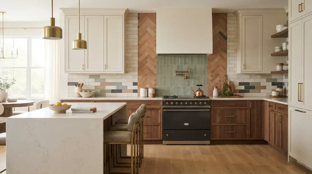
A kitchen backsplash can change the entire feeling of a room without requiring a complete renovation. The right tile color adds character, creates visual balance, and gives cabinets and countertops a finished look. It can also become one of the easiest ways to introduce warmth, contrast, texture, or a subtle statement.
Choosing the right combination can feel surprisingly difficult. A white cabinet kitchen can handle far more than plain white subway tile, while dark cabinetry can look completely different with warm cream, soft green, or handmade-looking tile. Even a small kitchen has plenty of room for personality when color and proportion work together.
The key is to look at the kitchen as a whole rather than choosing a backsplash color in isolation. Cabinet undertones, countertop patterns, flooring, natural light, hardware, and even the amount of wall space between the counters and cabinets all affect the final result.
In my experience, the most successful backsplash designs rarely rely on one dramatic element. Instead, they combine a thoughtful color with an appropriate tile shape, finish, and grout choice. That approach creates a kitchen that feels intentional rather than overly decorated.
This collection brings together ten versatile color directions, from warm neutrals and classic whites to earthy greens and sophisticated blue-gray tones. Each idea includes practical styling advice, material considerations, and ways to make the backsplash work with the rest of the kitchen.
Whether you’re refreshing a rental kitchen, planning a remodel, or simply collecting ideas for your next project, these combinations can help narrow down your choices and make the design process much easier.
Table of Contents
1. Warm Cream Tile
A soft cream backsplash brings warmth and timeless character to kitchens with light or natural finishes.
2. Sage Green Tile
Muted green introduces an earthy accent while keeping the kitchen calm and approachable.
3. Soft White Subway
Classic white tile creates a clean backdrop that works with almost any cabinet style.
4. Blue Gray Mosaic
Blue-gray tile adds understated color while maintaining a sophisticated, neutral appearance.
5. Terracotta Accent
Terracotta-inspired tile brings warmth, texture, and an inviting Mediterranean influence.
6. Charcoal Contrast
Deep charcoal creates definition around pale cabinets and adds a modern architectural feeling.
7. Dusty Blue Tile
Dusty blue adds personality without overwhelming the room, especially beside warm white cabinetry.
8. Beige Stone Look
Stone-inspired beige tile creates a natural backdrop with subtle variation and depth.
9. Glossy Olive Tile
Olive green with a reflective finish brings richness and visual movement to the backsplash.
10. Patterned Neutral Tile
A restrained pattern creates interest while keeping the overall palette easy to live with.
1. Warm Cream Tile
Quick Benefits
- Adds warmth without overpowering the kitchen
- Works beautifully with white and wood cabinetry
- Creates a timeless foundation
- Complements brass, bronze, and black hardware
- Helps soften cool countertops
Why It Works
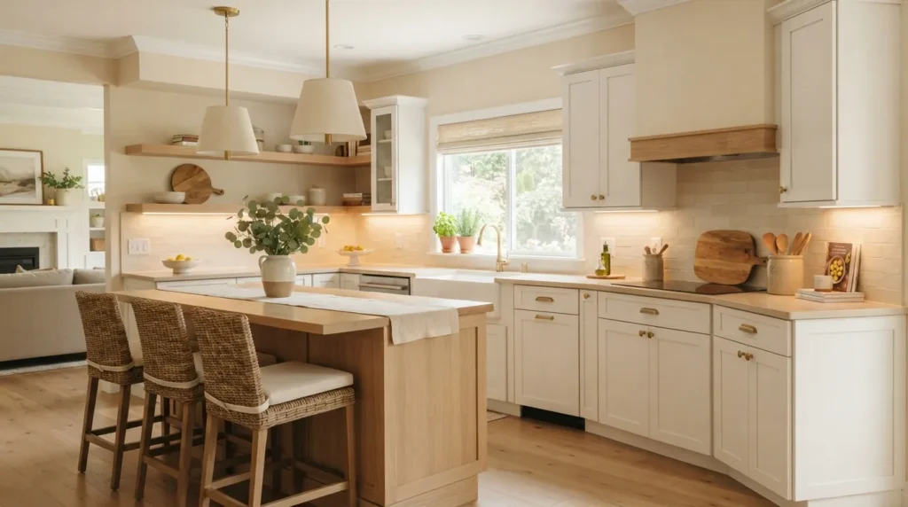
Warm cream is one of those backsplash colors that can quietly pull an entire kitchen together. Unlike stark white, cream introduces a gentle warmth that feels especially comfortable beside natural wood, warm white cabinets, butcher block, and beige countertops.
The color also works well when a kitchen receives limited natural light. A soft reflective surface can brighten the wall while avoiding the slightly clinical appearance that some very cool whites create.
Tile variation matters here. A handmade-look ceramic with uneven edges can make a cream backsplash feel collected and organic, while a smooth rectangular tile creates a cleaner modern appearance.
A mistake many homeowners make is matching the backsplash too closely to a countertop without considering undertones. Cream looks best when its warmth connects naturally with other finishes rather than competing with them.
How To Style It
Pair cream tile with warm white cabinets, natural oak shelving, or medium-toned wood floors for a relaxed kitchen. Brass cabinet pulls can emphasize the warmth, while matte black hardware creates sharper contrast.
For a traditional space, try a simple rectangular tile installed in a classic running-bond pattern. A slightly irregular handmade finish creates more character in a farmhouse or cottage kitchen.
If the countertop contains several colors, keep the tile relatively quiet. A creamy backsplash with subtle tonal variation gives the eye somewhere to rest.
For small kitchens, a glossy cream finish can reflect daylight and make the wall feel more open. Continue the tile close to the underside of upper cabinets for a more finished appearance.
2. Sage Green Tile
Quick Benefits
- Introduces a natural color
- Pairs beautifully with wood
- Works with brass and aged finishes
- Creates a relaxed atmosphere
- Adds personality without feeling overwhelming
Why It Works
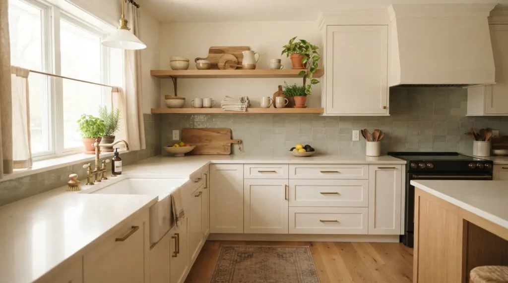
Sage green has a particularly comfortable relationship with kitchens because it echoes natural foliage without becoming overly bright. Its muted quality makes it easier to live with than stronger green shades, especially when used across a backsplash.
This color works especially well with warm white cabinetry. The combination creates contrast while maintaining a soft overall palette. It also pairs naturally with wood because both colors share an earthy quality.
Lighting can change sage considerably. Under warm evening lighting, some shades become almost olive, while cooler daylight can make them appear fresher. Sample tiles in the actual kitchen before committing to a large installation.
Glossy sage tiles can create a slightly vintage appearance, while matte or satin versions feel more contemporary. Small variations in tone can make the backsplash look more handcrafted and dimensional.
How To Style It
For a welcoming kitchen, combine sage backsplash tile with creamy cabinets and light oak accents. Natural wood cutting boards, woven textures, and simple ceramic accessories reinforce the organic character.
Brushed brass hardware creates a warm traditional look. Matte black hardware gives the same green tile a more modern edge.
Consider a vertical stack pattern if the kitchen has a contemporary design. A classic brick arrangement works better for cottage, farmhouse, and transitional spaces.
Keep surrounding finishes relatively restrained. Sage already provides color, so a busy countertop may compete with it. A lightly veined quartz or simple natural stone surface gives the backsplash enough visual breathing room.
3. Soft White Subway
Quick Benefits
- Creates a timeless appearance
- Works with nearly every cabinet color
- Makes small kitchens feel brighter
- Easy to coordinate with different finishes
- Supports future decor changes
Why It Works
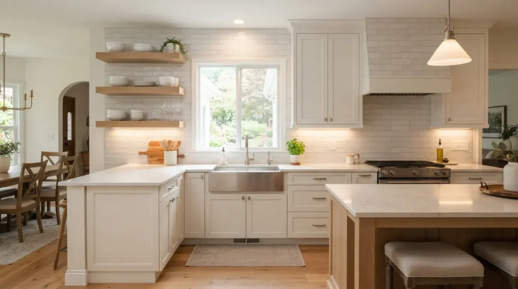
There is a reason simple white tile remains a favorite in kitchen design. It provides a clean visual background while allowing cabinets, lighting, hardware, artwork, and accessories to take the lead.
Soft white is particularly useful when a kitchen already contains several finishes. Instead of introducing another strong color, it creates a calm transition between the countertop and cabinetry.
The important distinction is between flat, bright white and softer white with a warm or slightly creamy undertone. The latter often feels more comfortable with wood cabinetry and warm flooring.
Grout can completely change the appearance. Matching grout produces a seamless effect, while contrasting gray grout emphasizes each individual tile. That makes grout an important design decision rather than an afterthought.
How To Style It
Use soft white subway tile with medium-gray grout for a traditional kitchen with visible tile definition. For a cleaner modern appearance, select grout that closely matches the tile.
White tile looks excellent with navy, charcoal, sage, olive, natural oak, and classic white cabinets. It also creates an easy backdrop for changing seasonal accessories.
For a small kitchen, consider extending the backsplash from the countertop to the underside of the cabinets. The uninterrupted surface can make the wall feel more cohesive.
A glossy finish reflects light, while a handmade matte or satin finish introduces subtle texture. Choose the finish based on the overall character of the room rather than treating white tile as one single style.
4. Blue Gray Mosaic
Quick Benefits
- Adds sophisticated color
- Works with cool and warm neutrals
- Creates subtle visual interest
- Complements stainless steel appliances
- Fits modern and transitional kitchens
Why It Works
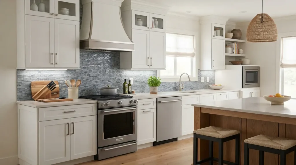
Blue-gray occupies a useful middle ground between color and neutrality. It has enough personality to make a backsplash noticeable, but its muted character prevents the wall from becoming the only thing you see.
This shade is especially attractive in kitchens with white, light gray, or natural wood cabinets. It can also complement stainless steel appliances because the blue-gray family naturally relates to cooler metallic surfaces.
A mosaic format adds another layer of detail. Small rectangular tiles, narrow stacked pieces, or subtle geometric layouts can create movement without requiring a dramatic pattern.
If your kitchen receives strong natural light, sample the tile at different times of day. Blue-gray can appear cooler in bright daylight and warmer under artificial lighting.
How To Style It
Pair blue-gray mosaic tile with white cabinets and brushed nickel hardware for a crisp transitional kitchen. To make the design warmer, introduce natural wood stools, oak shelves, or woven pendant shades.
A white or light quartz countertop can keep the backsplash from feeling too heavy. If using darker counters, select a blue-gray tile with enough light variation to maintain contrast.
For a modern kitchen, a small stacked mosaic creates a clean rhythm. A more traditional installation can use a classic geometric or offset arrangement.
Avoid adding too many competing colors. Let the blue-gray backsplash act as the primary accent and use accessories in related neutral tones.
5. Terracotta Accent
Quick Benefits
- Brings warmth into the kitchen
- Creates a Mediterranean-inspired feeling
- Complements natural materials
- Works well with cream cabinetry
- Adds character to simple kitchens
Why It Works
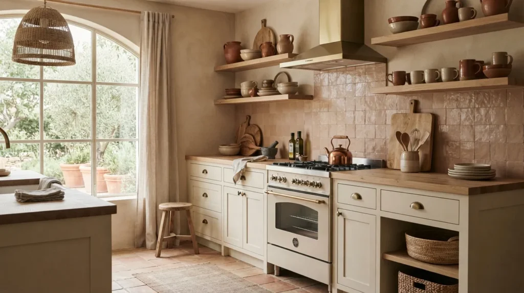
Terracotta-inspired tile introduces a warmth that can make a kitchen feel instantly more grounded. Its earthy orange, clay, and muted rust undertones work particularly well with cream, beige, natural wood, and other organic finishes.
This color can be especially effective in kitchens that feel too cool. A backsplash with clay-inspired tones provides visual warmth without requiring major changes to the cabinets or flooring.
The finish is important. Handmade-look terracotta tile can have small variations in color that create an artisanal quality. Porcelain versions can offer a similar visual effect with different maintenance characteristics.
Because terracotta is naturally expressive, the rest of the kitchen can remain relatively simple.
How To Style It
Use terracotta backsplash tile with creamy cabinets, light wood shelving, and natural stone countertops. Aged brass hardware can reinforce the warm Mediterranean feeling.
For a more contemporary kitchen, choose a muted terracotta rather than a bright orange shade. Pair it with simple flat-panel cabinets and minimal accessories.
A straight stack installation can make terracotta feel modern. Handmade irregular tiles create a more rustic appearance.
Keep textiles and accessories in related earthy colors such as sand, beige, olive, and warm brown. This creates a cohesive palette without making every element the same color.
6. Charcoal Contrast
Quick Benefits
- Creates strong visual definition
- Works beautifully with white cabinetry
- Adds modern sophistication
- Highlights architectural lines
- Makes hardware stand out
Why It Works
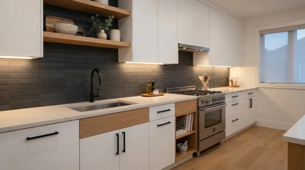
A charcoal backsplash can completely change the personality of a light kitchen. Instead of disappearing into the background, the backsplash becomes a strong architectural element that defines the cooking area.
The secret is choosing charcoal rather than an extremely dark black when you want a softer result. Charcoal retains contrast while allowing subtle texture and tile variation to remain visible.
This approach works particularly well with white cabinets because the two surfaces create a clear visual relationship. It can also look striking with pale wood, light gray cabinetry, and stainless steel appliances.
Dark tile benefits from thoughtful lighting. Under-cabinet lighting can highlight the surface and reveal texture that might disappear in a dim kitchen.
How To Style It
Pair charcoal tile with white cabinets and simple black hardware for a streamlined modern kitchen. For a warmer result, add natural oak shelves or wooden accessories.
Large-format charcoal tile can produce a minimal appearance with fewer grout lines. Smaller tiles create more texture and make the backsplash feel more detailed.
If the countertop is heavily patterned, select a charcoal tile with limited variation. If the counter is plain, a textured or softly mottled charcoal tile can add depth.
Under-cabinet lighting is particularly useful here. It illuminates the work surface while giving the backsplash a more layered appearance after sunset.
7. Dusty Blue Tile
Quick Benefits
- Adds gentle color
- Feels fresh without being bright
- Works beautifully with warm whites
- Complements brass hardware
- Fits coastal and traditional kitchens
Why It Works
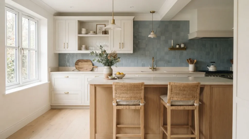
Dusty blue is a softer alternative to stronger navy or saturated blue. Its muted quality gives the kitchen a sense of color while keeping the overall environment peaceful.
This shade is especially effective when paired with warm white cabinets. The slight contrast makes the backsplash visible without creating a hard visual break.
Dusty blue also offers flexibility across design styles. With shaker cabinets and brass hardware, it feels traditional. With flat-panel cabinetry and simple lighting, it can look modern.
I’ve noticed that softer blues are particularly appealing in kitchens where homeowners want color but hesitate to commit to a dramatic statement shade. They provide personality while remaining relatively easy to coordinate.
How To Style It
Combine dusty blue tile with creamy white cabinets and warm brass hardware for an inviting transitional look. Light oak flooring can add another layer of warmth.
A glossy finish creates a slightly classic feel, while a matte tile feels more contemporary. Keep countertops fairly simple if the tile has noticeable color variation.
For a coastal-inspired kitchen, introduce woven bar stools, pale wood, and simple ceramic accessories. Avoid excessive nautical decoration so the design remains sophisticated.
A vertical tile layout can make the backsplash feel taller. A traditional offset pattern creates a more familiar kitchen aesthetic.
8. Beige Stone Look
Quick Benefits
- Creates a natural appearance
- Works with many cabinet colors
- Adds subtle texture
- Hides minor visual variation
- Complements warm neutral interiors
Why It Works
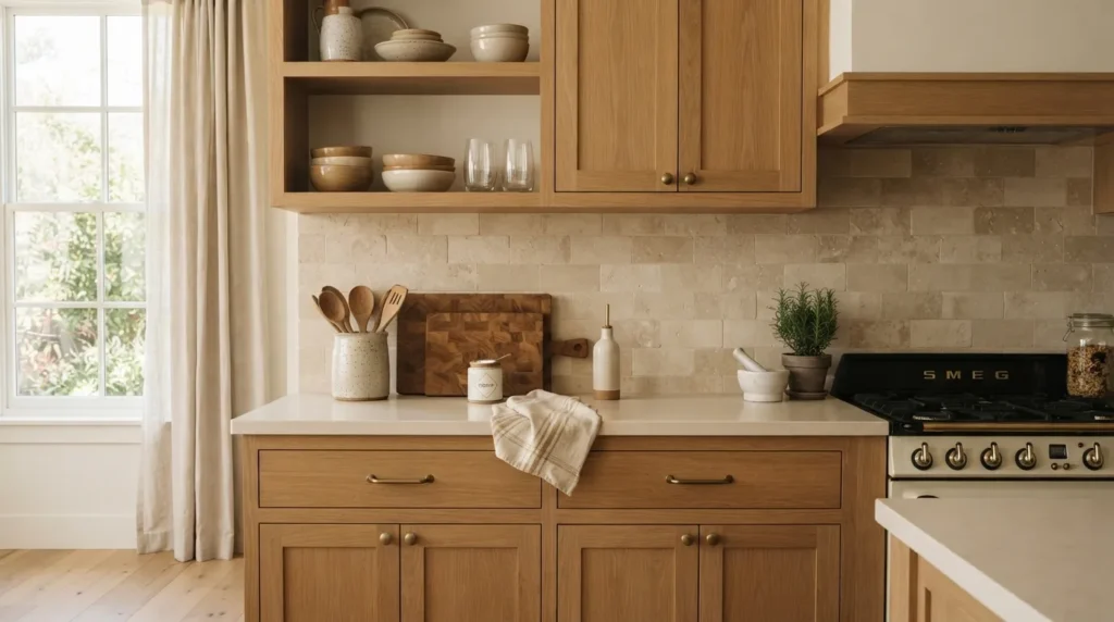
Beige stone-look tile is useful for homeowners who want the character of natural stone without making the backsplash visually dominant. Its gentle variation creates depth while maintaining a neutral foundation.
This approach is particularly effective in kitchens with wood cabinets because the warm neutral palette feels cohesive. It also pairs well with cream, taupe, greige, and soft white cabinetry.
Stone-look tile can mimic limestone, travertine, marble, or other natural surfaces. The best choice depends on the existing countertop. If the counter already has dramatic veining, a quieter beige tile can provide balance.
The backsplash does not need to match the countertop exactly. Coordinating undertones are often more important than identical colors.
How To Style It
Use beige stone-look tile with natural oak cabinetry, creamy walls, and warm metal hardware. The result can feel relaxed and timeless without looking overly formal.
For a modern kitchen, choose larger-format pieces with subtle variation and narrow grout lines. A smaller format works nicely in traditional or Mediterranean-inspired spaces.
Pair the backsplash with simple ceramic accessories, wood cutting boards, linen textiles, and understated lighting.
If the kitchen has limited natural light, choose a lighter beige with a slightly reflective surface. Darker beige can make the space feel heavier when used across a large wall.
9. Glossy Olive Tile
Quick Benefits
- Adds rich natural color
- Creates reflective movement
- Works with warm neutrals
- Looks beautiful with brass
- Gives simple kitchens more personality
Why It Works
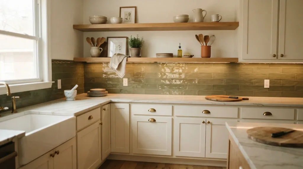
Olive green brings more depth than sage while remaining grounded and natural. When paired with a glossy finish, it catches light across the backsplash and creates subtle movement throughout the cooking area.
This combination works especially well in kitchens with warm white or cream cabinetry. The earthy green provides contrast without feeling as sharp as black or navy.
Glossy olive tile can also make a small backsplash feel more dimensional because light reflects across its surface. The effect becomes especially noticeable under under-cabinet lighting.
Because olive is a strong color, balance is essential. A simple countertop and restrained accessories allow the tile to become the feature without making the room feel busy.
How To Style It
Pair glossy olive tile with cream cabinets and aged brass pulls for a warm, collected appearance. Natural oak shelves can reinforce the connection to nature.
For a contemporary kitchen, use olive tile in a clean stacked pattern with flat-panel cabinetry. Keep decorative objects minimal and let the color provide most of the visual interest.
White quartz can brighten the overall composition, while warm stone can create a richer atmosphere.
Choose grout carefully. A close tonal match keeps the backsplash visually smooth, while a contrasting grout can emphasize the individual tile shapes.
10. Patterned Neutral Tile
Quick Benefits
- Adds personality without bold color
- Creates a focal point
- Works with neutral cabinetry
- Offers visual texture
- Makes a simple kitchen more memorable
Why It Works
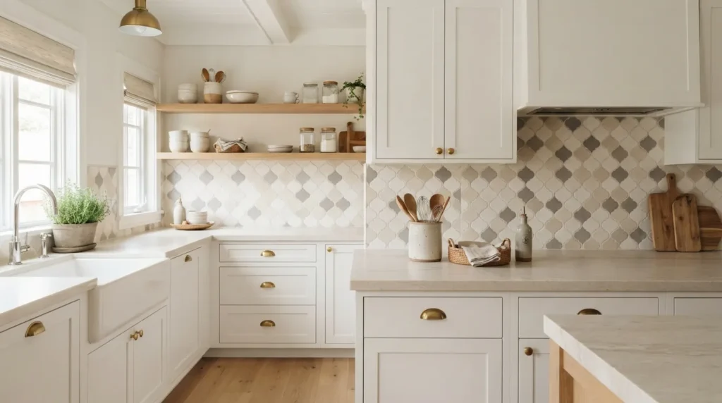
A patterned neutral backsplash proves that a kitchen does not need a strong color to feel interesting. Cream, beige, white, taupe, and soft gray patterns can create movement while maintaining an easy-to-live-with palette.
This approach works particularly well when the cabinets and countertops are simple. The backsplash becomes the decorative layer, adding personality without introducing another dominant color.
The scale of the pattern matters. A small kitchen often benefits from a restrained pattern with enough negative space to avoid visual clutter. Larger kitchens can accommodate more noticeable motifs.
Neutral patterned tile also has long-term flexibility. Changing bar stools, pendant lights, rugs, or accessories later does not require redesigning the entire color palette.
How To Style It
Pair patterned neutral tile with simple cabinets and countertops so the backsplash has enough room to stand out. White, cream, taupe, and light wood cabinetry are especially easy partners.
If the pattern contains several shades, pull one subtle color from the tile into accessories or textiles. This creates coordination without making the kitchen look overly matched.
Use simple hardware when the tile pattern is detailed. Brass, black, or brushed nickel can all work depending on the undertones.
For a farmhouse kitchen, choose a soft geometric or encaustic-inspired pattern. For modern spaces, look for minimal linework or tonal geometric designs.
Choosing the Right Backsplash Color
The best backsplash color depends on more than personal preference. Start by looking at the fixed elements that are expensive or difficult to change, such as cabinets, countertops, flooring, and appliances.
If your countertop contains several colors, identify its dominant undertone before selecting tile. Warm counters generally work well with cream, beige, terracotta, olive, and warm gray. Cooler surfaces can pair nicely with blue-gray, soft white, charcoal, and dusty blue.
Natural light is another major consideration. A color that looks balanced in a tile showroom can appear dramatically different in a kitchen with north-facing windows or limited daylight.
Always take physical samples home when possible. Look at them in the morning, afternoon, and evening. Place them next to the cabinets and countertop rather than evaluating them alone.
Matching Tile Color With Cabinets
White cabinets provide the greatest flexibility. Almost any backsplash color can work, but the cabinet undertone still matters.
Warm white cabinetry generally looks better with cream, beige, sage, dusty blue, terracotta, or warm gray than with an icy blue-white tile.
Natural wood cabinets already contain visual warmth, so neutral stone, soft white, sage, olive, or muted blue can provide balance.
Dark cabinets benefit from lighter backsplash surfaces when the goal is an airy kitchen. Cream, white, beige, and pale blue-gray create contrast without competing with the cabinetry.
If both the cabinets and backsplash are dark, strong lighting becomes increasingly important.
Choosing the Right Grout
Grout can change the appearance of a tile installation almost as much as the tile itself.
A matching grout color creates a smoother, more continuous surface. This approach works especially well with handmade-look tiles where you want the color and texture to remain the focus.
Contrasting grout emphasizes individual tile shapes. White tile with medium-gray grout, for example, creates a clearly defined pattern.
For colorful tile, a closely related grout usually creates a calmer appearance. Strong contrast can make an already colorful backsplash feel busier.
Practical considerations matter too. Kitchens experience splashes, cooking residue, and frequent cleaning, so grout color and maintenance requirements deserve attention before installation.
Choosing Tile Finish
The finish affects both appearance and atmosphere.
Glossy tile reflects light and can make a backsplash appear brighter. It works particularly well in smaller kitchens or spaces with limited natural light.
Matte tile has a softer appearance and can make colorful surfaces feel more understated.
Satin tile sits between glossy and matte, offering gentle reflection without a highly polished appearance.
Handmade-look tile introduces variation in edges, color, and surface texture. It can add warmth to modern kitchens and character to traditional spaces.
Think about how the finish interacts with your kitchen lighting. Under-cabinet lights can emphasize glossy surfaces and reveal texture in matte or handmade tiles.
Small Kitchen Backsplash Tips
A small kitchen does not automatically require plain white tile. The better approach is controlling visual clutter.
Choose one primary backsplash color and let other finishes support it. A small kitchen can handle sage, dusty blue, cream, or even charcoal when the rest of the palette remains disciplined.
Extending the backsplash vertically can create a stronger sense of continuity. Tile that reaches the underside of cabinets creates a finished visual plane instead of a collection of disconnected surfaces.
Reflective finishes can also help. Glossy tile bounces light around the room, while light-colored surfaces prevent the backsplash from visually closing in the space.
Avoid combining multiple strong patterns in a compact kitchen. If the backsplash contains movement, keep rugs, countertops, and decorative accessories relatively restrained.
How to Make a Backsplash Feel Expensive
A high-end appearance usually comes from coordination rather than expensive materials alone.
Start with a limited palette. Two or three primary finishes often look more intentional than a kitchen filled with unrelated colors.
Pay attention to tile scale. Extremely small tiles can look busy when used across a large wall, while very large tiles may feel disproportionate in a compact backsplash.
Consistent grout lines also contribute to a polished result. Careful installation can make a relatively simple tile look much more sophisticated.
Lighting matters too. Well-positioned under-cabinet lighting highlights the backsplash and improves the practical cooking area.
Finally, allow the backsplash to breathe. A beautiful tile can lose impact when surrounded by too many decorative objects.
Related Articles
- 10 Modern Kitchen Ideas for a Warm and Stylish Home
- 10 Small Kitchen Ideas That Maximize Every Inch
- 10 Kitchen Cabinet Color Ideas for a Fresh Update
- 10 Farmhouse Kitchen Decor Ideas With Timeless Charm
- 10 Kitchen Organization Ideas for a Clutter-Free Space
Frequently Asked Questions
What backsplash color makes a kitchen look bigger?
Light backsplash colors such as soft white, cream, pale beige, and light blue-gray can make a kitchen feel more open. Glossy surfaces can reflect available light and add brightness. Keeping the backsplash visually continuous rather than combining several contrasting colors can also create a more spacious appearance.
Should the backsplash match the countertop?
The backsplash does not need to match the countertop exactly. Coordinating undertones, materials, or subtle colors often creates a more natural result. If the countertop has strong veining or multiple colors, a quieter backsplash can provide balance. A simple countertop gives you more freedom to use colorful or patterned tile.
What backsplash color works best with white cabinets?
White cabinets pair well with almost any backsplash color. Cream, sage green, dusty blue, blue-gray, beige, olive, charcoal, and classic white are versatile choices. The best option depends on the cabinet’s undertone, countertop, flooring, lighting, and overall kitchen style.
Is subway tile still a good kitchen choice?
Subway tile remains a versatile choice because its simple shape works across traditional, transitional, farmhouse, and contemporary kitchens. Changing the color, finish, grout, or installation direction can give the familiar format a completely different appearance.
What backsplash color works with wood cabinets?
Wood cabinets generally pair well with cream, soft white, beige stone, sage green, olive, muted blue, and earthy terracotta. Since wood already introduces warmth, the backsplash can either reinforce that warmth or provide gentle contrast with a cooler muted color.
Is glossy or matte backsplash tile better?
Neither finish is universally better. Glossy tile reflects light and can brighten a kitchen, while matte tile offers a softer, more understated appearance. The choice depends on lighting, cabinet style, maintenance preferences, and the visual character you want.
How high should a kitchen backsplash go?
A backsplash commonly covers the wall between the countertop and upper cabinets. Some kitchens extend tile farther upward or across an entire feature wall for a more dramatic look. The appropriate height depends on cabinet placement, range configuration, wall proportions, and the desired design effect.
Conclusion
Choosing a backsplash becomes much easier when you stop looking at individual tiles and start considering the complete kitchen. Cabinet undertones, countertop patterns, flooring, lighting, hardware, grout, and tile finish all influence how the final design feels.
Warm cream and beige create timeless foundations, while sage, olive, dusty blue, and blue-gray bring controlled color. Terracotta introduces earthy warmth, charcoal creates contrast, and patterned neutrals add personality without relying on strong hues.
If you’re unsure where to begin, start with the kitchen elements that are already fixed. Take several tile samples home and examine them beside your cabinets and countertop throughout the day. Pay attention to how the color changes in natural and artificial light.
Then narrow your choices to one primary direction. A backsplash becomes more successful when it supports the rest of the room instead of competing with it.
You do not need an elaborate design to create a beautiful kitchen. Sometimes a carefully chosen tile color, thoughtful grout, good lighting, and a restrained palette are enough to give the entire space a fresh, finished character.